
Map crown, brim and trim colors
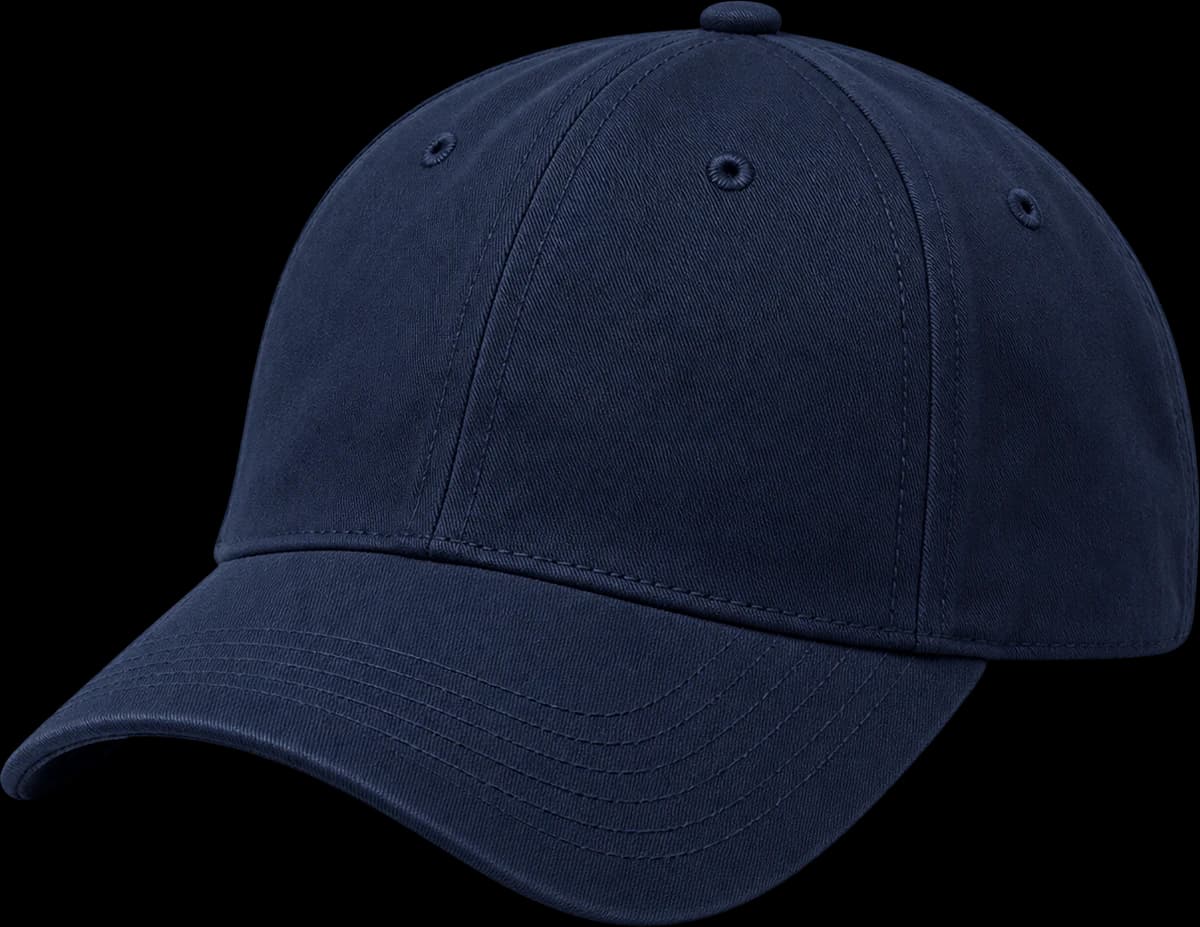
A two-tone reference still has many color decisions. Draw or annotate crown, brim top, brim underside, top button, eyelets, closure and artwork. Mark any element that must match another. This avoids a sample with a third accidental shade introduced through the small components.
Use identifiers such as A for crown and B for brim, then apply those identifiers to each small component. This lets you explore another palette without redrawing the whole design. Keep the artwork thread reference separate, especially when a thread is intended to echo a fabric rather than use an unrelated accent.
Balance the logo with the contrast brim
Lay the two material swatches next to the artwork and consider the cap at both close range and normal viewing distance. Similar values create a subtle result; stronger value contrast makes the brim a graphic line. Use your audience and collection palette to choose that relationship instead of relying on a product render alone.
Try the combination against the clothing colors your audience will wear. A cream crown can become the dominant feature over a dark outfit, while a dark brim frames the face more strongly. Decide whether the cap should blend into a coordinated collection or serve as its accent, and record that intention with the palette.

Start with the overall proportion, crown shape and artwork scale.
Generated design study; inspect the physical sample before approval.Count finished two-tone colorways
Name each complete combination and give it its own quantity. A cream crown with a green brim and a green crown with a cream brim are separate finished colorways. Include any corresponding thread changes in the same record so quotations and sample notes use an unambiguous reference.
If you want to test several combinations, prioritize the one that best represents the design before requesting sample variants. Explain which elements are fixed across the range and which change by colorway. A shared logo placement can simplify the discussion, but each different thread and fabric pairing still needs a clear approval record.
Approve component colors on the cap
Confirm colors on the finished materials, including thread and closure, under consistent lighting. Different surfaces reflect light differently even when they share a color reference. Record acceptable matches and any revisions in writing. Review the front and rear so no overlooked trim breaks the intended two-tone treatment.
Check the transition at the brim join for stray contrast stitches that would be less visible on a tonal cap. Photograph the top button and rear closure as well as the hero angle. Label your feedback by component so a correction to the brim color cannot be mistaken for a change to the crown.

Read the back, panel junctions and adjustment or continuous crown.
Generated design study; inspect the physical sample before approval.A practical buying example
Consider a cream crown with a navy visor, navy front embroidery and cream strap. That is one colorway. Keeping the cream crown but changing the visor and embroidery to green creates a second. Write both combinations in full, including underbrim and closure details. If you only change the artwork, still identify the variation and confirm its order grouping rather than assuming it is covered by the original specification.
Questions to settle before requesting a sample
Decide which contrast should lead: the visor, logo or another trim. A contrasting top button and eyelets can make a restrained two-tone concept busier than expected. Review the hat at normal viewing distance and from the back before approving the palette. Ask whether crown and brim swatches have been compared under the same conditions, and keep the approved component map with the sample reference.