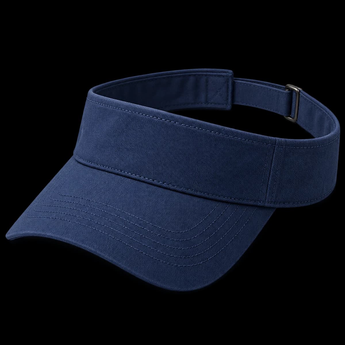

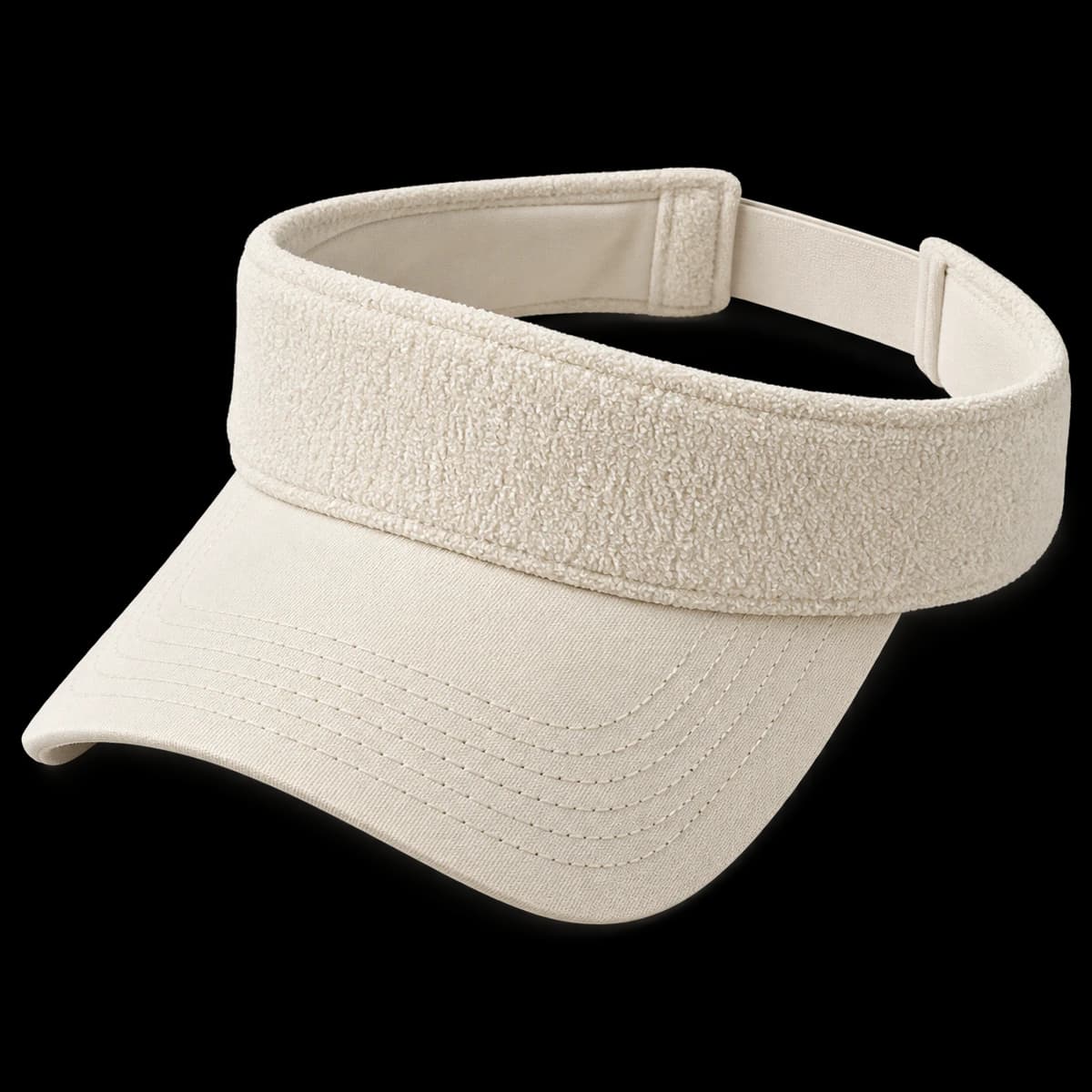
Terry placement and hand
Specify where the terry material is used: outside, inside or both. Confirm its actual composition and hand with a sample.
Provide a fabric reference showing the loop surface and request the proposed composition. Describe the desired hand separately from color. If terry is used only inside, the exterior may need its own material entry. A broad instruction such as “terry visor” leaves the factory to decide where that texture belongs.
Band-to-brim junction
Check the seam where the band meets the brim. The texture should not conceal an uneven junction or make the band bulky against the skin.
Inspect the band-to-brim seam from outside and inside. Texture can hide an uneven line in a photograph while the same junction feels bulky against the forehead. Point to the exact area in review notes. Keep band height and brim curve unchanged when assessing a revised seam treatment.
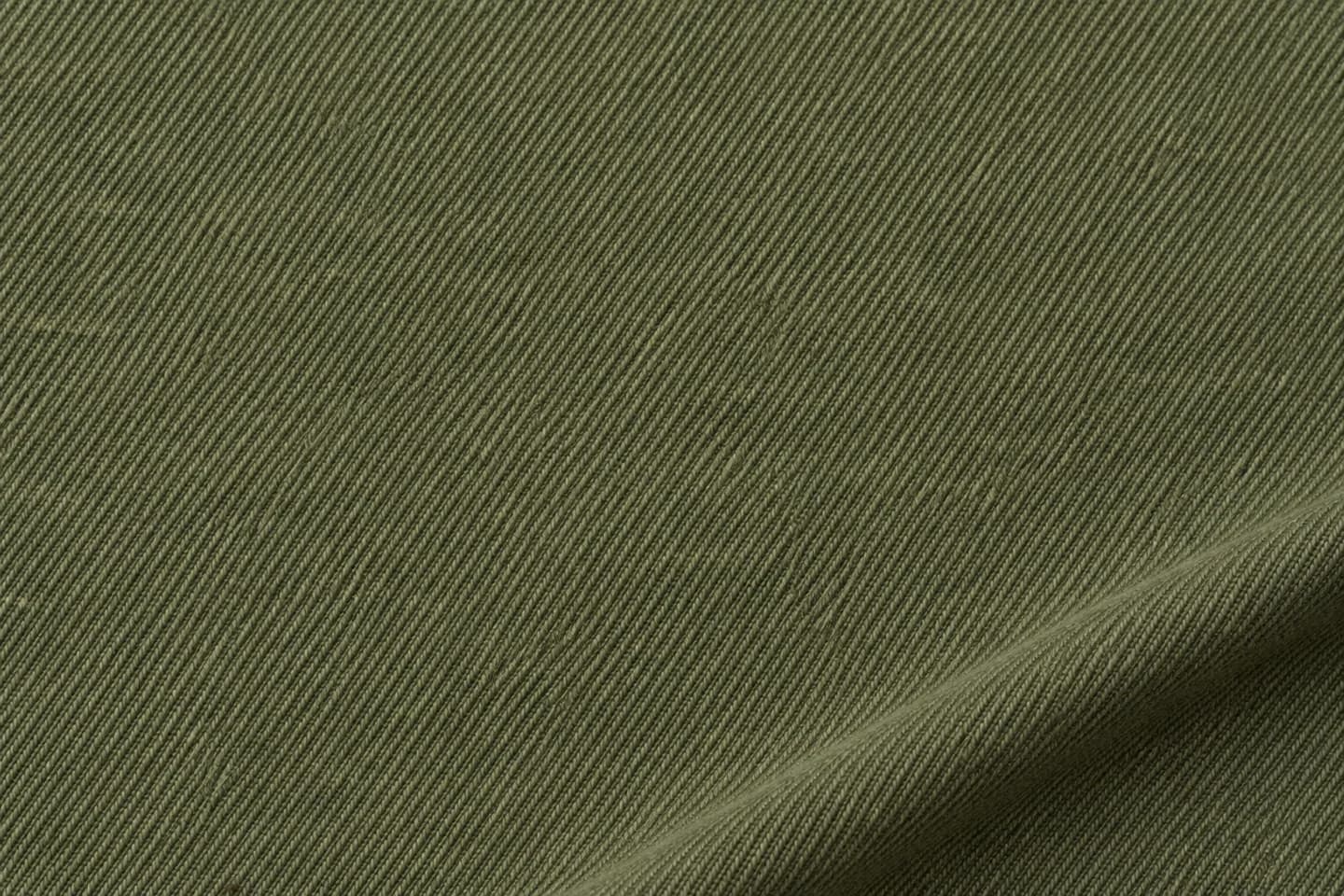
Name the composition, weight and finish you require. Compare the cloth and decorated sample together.
Illustrative texture; not a certified fabric specification.Artwork on texture
Review the mark on the proposed terry surface. If the texture competes with the artwork, discuss a separate label and its attachment.
Fine artwork can compete with the looped surface. Review the mark at intended size on the proposed cloth and inspect its edges. If a separate label is considered, check the border and attachment as well as lettering. The alternative should be sampled deliberately rather than shown only as a clean digital overlay.
Inside surface review
Inspect the inside band after handling. Do not infer absorbency or other performance from appearance; state any functional requirement for confirmation.
Wear and handle the sample to assess the inside contact area and closure. Identify any particular absorbency or other performance requirement independently; the visual presence of terry does not establish a tested result. Ask what evidence would be needed before using a functional claim in retail copy.
A practical buying example
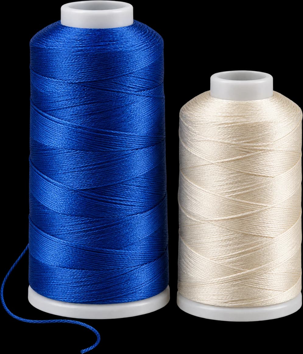
A buyer likes the textured look of a cream terry visor but wants small blue text across the band. If the text disappears into the loops, compare a simplified mark with a label version. Review both at the same width and position. Changing band height and artwork at the same time could conceal whether the decoration solution actually improved readability.
Questions to settle before requesting a sample
Choose terry for a clearly described surface and wearing requirement. Ask where it is used, what the fabric contains and how the logo will be reviewed on that surface. Check the seam under the band and closure attachment. If the aim is a very sharp small wordmark, compare a smoother band before committing to the textured option.