

Specify canvas front support
Describe whether the cap should look crisp when unworn or settle into a softer profile. Canvas appearance alone does not communicate this. Submit a side reference and review front support during sampling. The right choice depends on the silhouette and artwork, not simply on whether the fabric feels heavy in your hand.
Compare the front from the side with the cap adjusted to the expected wearer. A firm canvas appearance can hide a front that sits too far forward or too deep. If the profile needs changing, specify the direction of change and keep the artwork position provisional until the revised crown shape has been reviewed.
Compare patches and direct embroidery
A patch creates its own graphic boundary and can separate fine artwork from a textured ground. Direct embroidery integrates the mark with the canvas. Compare both against your logo requirements and ask for a feasibility review of detail, edge finish and attachment. Confirm the decorated sample rather than approving only a digital placement.
A broad patch can cover much of the front and make the cap feel more badge-led than fabric-led. A smaller patch leaves canvas texture visible but reduces the available space for lettering. Choose the hierarchy first, then discuss border treatment and attachment; these should support the chosen scale rather than compensate for crowded artwork.

Inspect the material character and how it meets stitching and decoration.
Generated design study; inspect the physical sample before approval.Match or contrast canvas and mesh
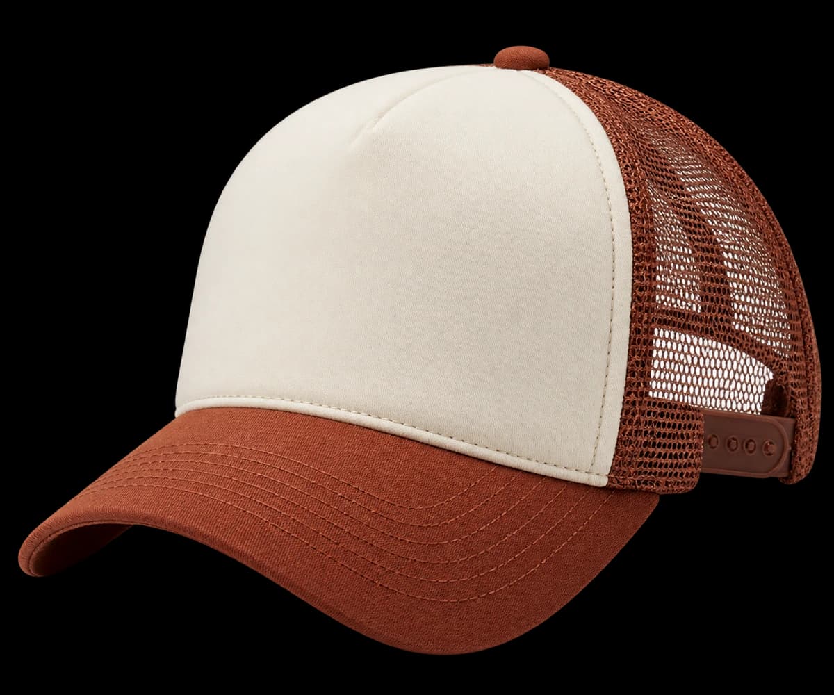
Canvas and mesh reflect color differently. State whether you want a close tonal relationship or an intentional contrast; do not leave matching expectations implied. Include the brim and adjustment closure in the review. Where exact color control matters, discuss physical references and what matching standard can be agreed for each component.
Ask whether a close match between canvas and mesh is essential, or whether a deliberate tonal difference would serve the collection better. Communicate that tolerance visually using approved references. If a near match looks accidental on the sample, reconsider the contrast relationship rather than repeatedly changing one component without reviewing the whole palette.
Inspect mesh-to-canvas seams
Examine the join from solid front to mesh, the brim attachment and the patch corners if used. Wear the cap at the intended adjustment and check whether the rear opening and front depth feel balanced. Log shape revisions separately from color revisions so the next sample has a clear set of instructions.
Inspect the front-to-mesh seam with the cap both worn and unworn. Note whether the transition creates an unwanted ridge or pulls the front out of shape. For a patch version, also check its lower corners when the brim is held naturally; decoration stiffness and front curvature should be judged together during approval.
Inspect the material character and how it meets stitching and decoration.
Generated design study; inspect the physical sample before approval.A practical buying example
A tonal olive trucker can use matching color names yet show different shades on canvas and mesh. View the two physical materials together before changing either one. Decide whether a close visual match or deliberate contrast is the target. Then evaluate the decorated front: a firm patch can change how a softer canvas panel sits, even when its color is correct.
Questions to settle before requesting a sample
If the priority is a relaxed fabric front, compare the undecorated and decorated appearance through sampling. If the priority is a clear badge, inspect the patch edge and backing as well as the face. Ask how the selected canvas, support and mesh meet at the side seam. Check the inside junction for bulky edges rather than approving only the outward contrast.