
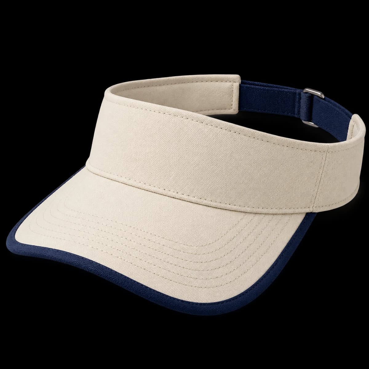
Component color map
Map the band, visor top, underside, binding and strap colors. Show the complete combination rather than only naming two colors.
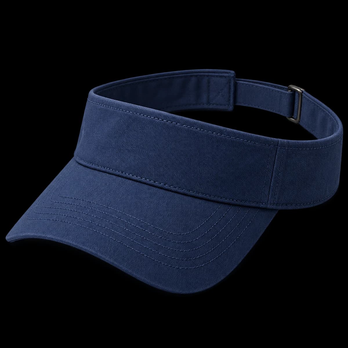
List outer band, brim top, underside, binding and rear strap separately. A navy-and-cream palette could place those colors in several ways. Use one annotated drawing per finished combination and give each a code. This lets the quote and sample comments refer to the same arrangement.
Binding width and curve
Set a binding-width reference and review it around the curve. Look for a consistent visual line from the front to the sides.
Show the desired visible edge width and compare it along the entire curve. Look at the transition near the band as well as the front center. If the outline appears uneven, mark the location in a photograph instead of asking to make the whole binding narrower. Inspect the reverse side at the same time.
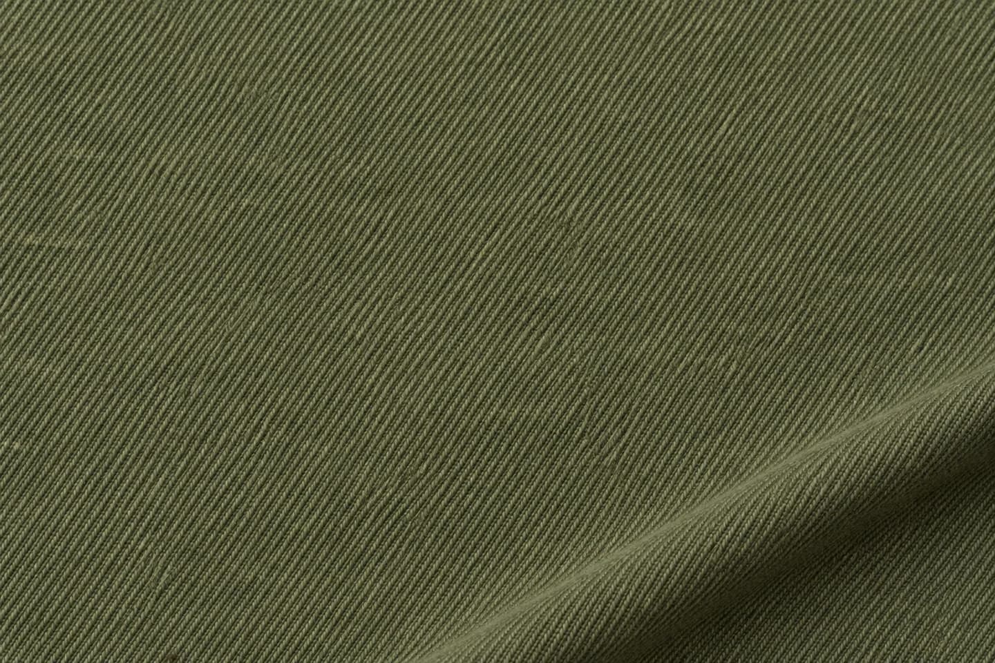
Name the composition, weight and finish you require. Compare the cloth and decorated sample together.
Illustrative texture; not a certified fabric specification.Graphic hierarchy
Coordinate artwork contrast with the edge color. Avoid adding a third competing accent unless it has a clear role in the design.
Decide whether the edge or the logo should be the stronger accent. Adding a contrasting logo color can create another focal point in a small area. Review the complete visor at normal viewing distance and then check the smallest lettering close up. Both views are needed to judge the design.
Binding join and rear closure
Check the binding join, inside band and rear closure. Photograph any uneven transition and name it in the sample revision list.
Find the binding join and inspect how it is finished. Open the rear adjustment and review its connection to the band. A clean front image does not show either detail. Record any uneven transition in the sample notes with the colorway and photograph so it can be checked on the revision.
A practical buying example
For a navy visor with cream binding, a buyer wants a fine outline rather than a thick border. Supply a width reference and mark where it is measured. If one side looks wider, compare the same angle before changing the specification. Keep the navy band and logo unchanged while the edge treatment is resolved.
Questions to settle before requesting a sample
This direction works when a visible outline is an intentional part of the brand. Ask how binding width is defined on the curved visor, where the join will sit and how underside color relates to the edge. If the product should look almost tonal, a plain cotton visor may be a better reference than a heavily contrasted mockup.